LESSON 3: ANALYSING GRAPHS AND POPULATION PYRAMIDS

|
Learning Goal: We are learning to analyse data from graphs (like population pyramids) and make inferences about quality of life.
KEY VOCABULARY Quality of life: Human well-being, measured by social indicators (education, environment, health, living standards). Demographics: Statistics for an area’s population relating to age, sex, income and education. Life Expectancy: The average number of years a person is expected to live. |
Graphs and charts can be “read” to determine important information about geographic data. Graphs and charts organize information visually, allowing us to see trends or patterns. This allows us to infer information (just like when we’re reading!) and determine if any information is missing.
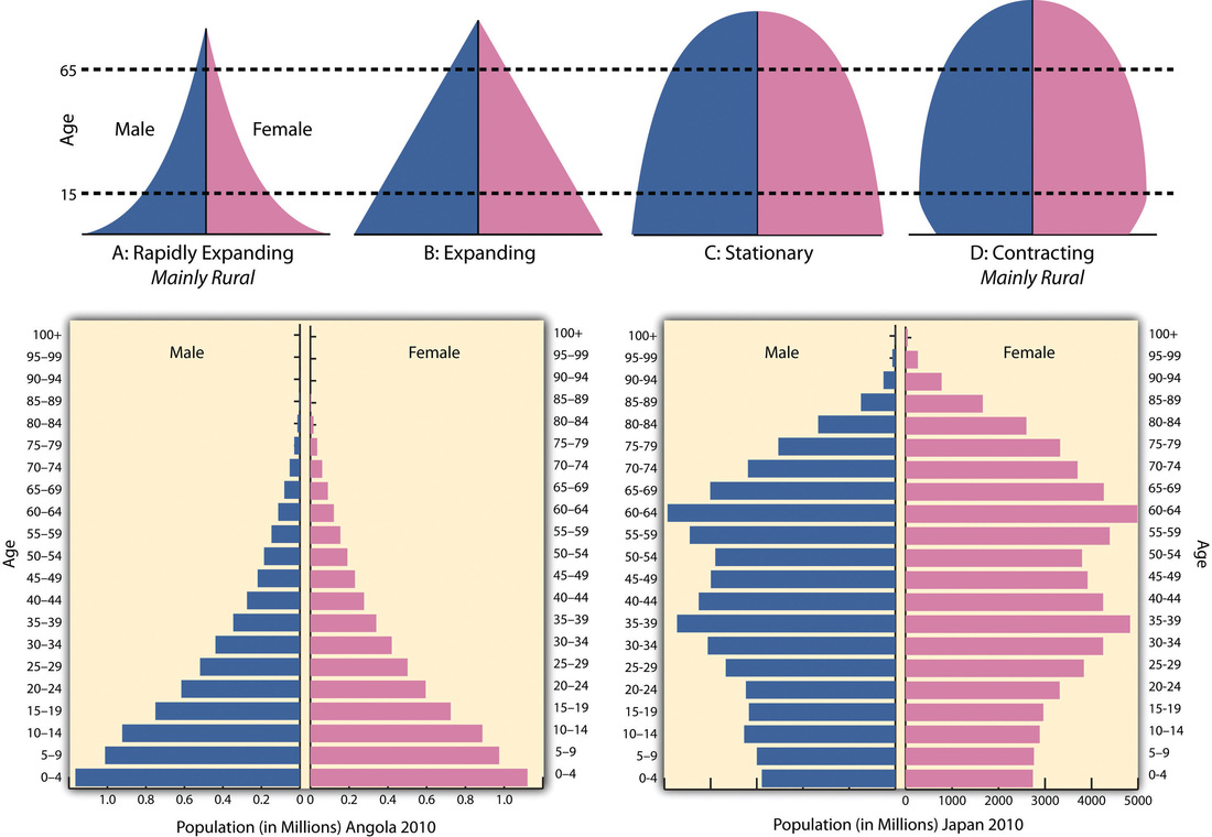
Population Pyramids are horizontal bar graphs that indicates the number of people in different age groups and the balance between males and females.
Population Pyramids are horizontal bar graphs that indicates the number of people in different age groups and the balance between males and females.
| gb_l3-_analysing_graph.pdf |
